Wednesday, December 30, 2015

What Harry Got Wrong In 2015

I f-ed up a lot in 2015. It’s bound to happen when you’re predicting things for a living and involved in approximately 200 articles, chats, podcasts and videos per year. I also got a lot right. But that, or the volume of work, doesn’t excuse my errors.

So what exactly did I screw up?

One of the biggest errors I think I made in 2015 was concentrating too much on who would win the Republican nomination and not so much on who would drive the conversation.2 You can see that clearly with Donald Trump (who I still don’t think will win the Republican nomination). Not only did I dismiss Trump’s candidacy on many occasions (here, here, here and here, for example), I was sometimes eager to do so in order to confirm my original belief that he wouldn’t win.

But winning the race and affecting the race are different things. Trump may lose in Iowa, collapse in New Hampshire and disappear from the national stage. If that — or something like it — happens, much of the sound and fury surrounding Trump in 2015 will seem silly in retrospect. But regardless of where Trump ends up once voting starts, he has certainly been the dominant voice in the Republican nomination race so far.

One big reason I didn’t take Trump seriously was because he entered the race with relatively poor favorability ratings, and putting too much stock in those was another semi-major mistake I made in 2015. My research showed that past nominees started their campaigns either well-liked or not well-known; Trump was the opposite: well-known and disliked. But I underestimated how much voters’ impressions of even well-known candidates can change. Trump’s favorability ratings among Republicans, while still mediocre, improved a ton.

You can see something similar with Chris Christie. I poohpoohed his chances early and nearly as often as I did Trump’s. I still don’t think Christie is at all likely to win the GOP nomination, but Christie, like Trump, was able to regain at least some modicum of popularity among Republican voters, which has made him competitive in New Hampshire.

What else did I mess up? We’ve talked a lot about the endorsement primary — the competition for support from party officials. What I didn’t seem to emphasize enough at times is that just because someone doesn’t win the endorsement primary doesn’t mean that candidate can’t be competitive. It just means he or she is less likely to win. Gary Hart, for example, was crushed in the Democratic endorsement race in 1984, yet fought Walter Mondale until the last primary. A more recent example: Rick Santorum emerged as the main opponent to Mitt Romney in the 2012 Republican primary despite a severe lack of support from elected Republicans.

Put another way, I didn’t communicate that the endorsement primary doesn’t predict vote percentage as much as it predicts winners. Many candidates who had the second-most support in the endorsement primary didn’t come close to winning the nomination (Howard Baker in the 1980 Republican campaign, John Glenn in the 1984 Democratic campaign and Phil Gramm in the 1996 Republican campaign, for example). Potential isn’t the same as potential realized. This year, that was true for Scott Walker, and it will probably be true of Jeb Bush as well.

Moreover, the party actors have a say in the primary only when they decide to. It was my belief at the beginning of the primary process that Ted Cruz would be a dead duck because most of his fellow GOP officeholders don’t like him. What I didn’t anticipate back in March (before Trump entered) was that the party actors might have too many favored candidates still in the race (Bush, Christie and Marco Rubio) to pick a favorite and too many they didn’t like (Cruz and Trump) to form a united front before the primaries started.

What I can take heart in (and I hope my readers can too) is that I can learn from these missteps and apply their lessons in the future. In fact, I’ve already acknowledged that Christie has a shot in New Hampshire and that Cruz has a shot at winning the nomination. Only a fool sticks to his original viewpoint when the facts change and it becomes clear that his hypothesis was off-base.

What Sci-Fi Gets Wrong, Design Fiction Could Get Right

Image: 20th Century Fox

In 1998, Steven Spielberg convened a panel of experts in a Santa Monica hotel to convert the script of Minority Report from science fiction to “future reality.” The result was one of the most captivating (albeit mainstream), visualizations of a potential technological future in recent memory. The film is now something of a benchmark for measuring the evolution of certain technologies, in how close the appear like the futuristic creations made by special effects in the film.

But the process of putting technologists and creators of fiction together in the same room—or even merging the activities in one person’s job description—is hardly limited to big budget productions. Corporations, artists, designers, and more all take part in a process that is known by several names, but which is generally recognized now under the name of “design fiction.”

Design fiction is a process of merging fictional worlds with the creative design in this world, hybridizing our notions of reality and fiction into particular objects, with a look to the future. In his seminal 2009 “Design Fiction: A Short Essay on Design, Science, Fact and Fiction,” Julian Bleecker frames the combination as, “assemblages of various sorts, part story, part material, part idea-articulating prop, part functional software. The assembled design fictions are component parts for different kinds of near future worlds.”

Drone Aviary from Superflux on Vimeo.

Superflux is a design practice specializing in these sorts of assemblages. Their recent Drone Aviary project takes the current interest in drones and projects it forward: showing drones that could be used for advertising, traffic management, surveillance, and naturally, selfies. Using prototypes and well-produced videos, Superflux bridges the distance between current technological realities and future possibilities, imagining a future by acting it out with objects.

There is a sense in which design fiction can be viewed simply as prediction: an attempt to square fact with fiction. Designers strive to create a vision so good, the future moves to imitate the art. As Bleecker points out, “Minority Report interface” is now a watchword for computer interaction designers. The challenge for design fiction becomes whether or not one’s insight is good enough that one’s creativity can become reality. To deploy a less futuristic metaphor: everyone wants to back the winning horse.

One predicts the winner of a race by having the best method for judging the competitors. Or, in the case of technology, by understanding it well enough that you can see what will eventually take shape, and what will be thrown in the dustbin: the ray guns and jetpacks of the past. By seeing the starting line clear enough, one can envision the finish line.

Technology corporations, therefore, pride themselves in their own design fictions, attempting to present a case in which their technology takes center stage in the future. Apple created the concept video for their “Knowledge Navigator” tablet in 1987, which, while dated in aesthetic, successfully predicted the company’s role in the development of tablet computers decades later. More recently, Corning, the company that developed the screen glass that enabled Apple’s phones and tablets, produced their own video called A Day Made of Glass, showing a future wherein their tech becomes even more fundamental to daily life than it already is—notably, it isn’t too far off from Minority Report interfaces.

But perhaps the primary question for future technology is not whether it will work, but whether it will work in the way we expect. Will display walls be fantastic, or will they be annoying? Will they be iPhones, or Segways? The technology will be functionally identical, regardless of whether we like it. The horse will always be the same horse when it crosses the finish line. The biology of the horse doesn’t care whether it wins or loses.

Eadweard Muybridge’s famous image of a horse in motion. Via Library of Congress Prints and Photographs Division

The Center for Genomic Gastronomy created glowing sushi, using genetically-modified fish meant to be sold as pets. This sort of unanticipated effect of future technology takes a central role in non-corporate design-fiction, where the emphasis is not just predicting the future, but predicting diverse or bizarre futures.

Designing concepts of the future ultimately shapes the future itself, as Minority Report shows. Without anyone betting on the horse race, there would perhaps be no track, no jockeys, no tickets. The horse would be standing in a meadow, simply being a horse. Design fiction creates fantasies of the future that function to build up the notion of the future as a race worth winning. And nothing quite trumps the moment when the horse everyone wants to win actually does—whether underdog or Triple Crown favorite. When fact fulfills fantasy, we say “the future is here.”

But creativity is more than betting on futures, and mainstream science fiction films and corporate concept videos are only part of design fiction’s potential. What Superflux and the Center for Genomic Gastronomy clue us into is not the tech, but the aesthetics of the way the tech might look: understanding the the future as a fantasy, an imagined end goal. Apple’s Knowledge Navigator got the tech right, but the aesthetic all wrong. What aesthetic aspects of Corning’s A Day Made of Glass will look hopeless passé, two decades from now? The ability to shape our image of the future is a critical opportunity as great as shaping the future itself. Design fiction can change the race, and try to make the race one worth winning. As sci-fi author Samuel Delany noted in his review of the original 1977 Star Wars film: “When you travel across three whole worlds and all the humans you see are so scrupulously Caucasian and male, Lucas’s future begins to loom a little dull.”

Follow Adam Rothstein on Twitter

Related:

This High Tech Table Is Straight Out of Minority Report

[Longreads] The Complexities of Drones in Art

Saturday, December 26, 2015

Visit this Virtual Gallery For an Anti-Gravity Art Experience

All images courtesy of Paper-Thin

When Daniel Smith and Cameron Buckley looked out at the digital art gallery landscape, they saw few that were navigable or interactive. Not content with the status quo, they decided to create Paper-Thin, an experimental art space and virtual reality art archive whose immersion would confound the separation of the real, physical and simulated in the experience of artwork—rendering, as it were, these boundaries paper-thin. 

Rachael Archibald’s carnate (in-pinking) is the gallery’s latest installation. When entering Paper-Thin, which looks like a modern art space, the viewer navigates using the arrow keys toward the rear-left of the virtually gallery to find Archibald's piece. The room is spacious, and roughly in the middle stands three walls, around which float digital objects wrapped in painterly texture and depth. 

“Rachael Archibald's installation entails antigravity, glowing walls, and a massive boulder flowing through the ceiling and floor like butter,” Smith tells The Creators Project. “[All] works are custom installed, and in many cases completely newly made for the space. Each room is simply a placeholder and point of access, and artists are free to modify any parameters they wish.”

Aside from Archibald’s carnate (in-pinking), Buckley tells The Creators Project that three other artists have already installed works: Alan Resnick’s Ring Worm was introduced in September, Hunter Jonakin’s Collector’s Digital Art Piece: Platinum Artist’s Proof in October, and Daniel Baird and Haseeb Ahmed’s collaborative HWBMx8 in December. 

The current iteration of Paper-Thin will feature two more installations—one by Hugo Arcier in January, and another by Andy Lomas in February. Smith says that each of the installations will remain accessible indefinitely. Once all of the rooms are filled, Smith and Buckley will open a new space for new work, which may be designed in collaboration with an architect. 

“Paper-Thin grew out of a frustration with the current format of the gallery in the physical world,” Buckley says.  “Restrictions like distance, money, time, and content become minimized in this online format because of the openness and availability of the internet. One of our goals is to offer an alternative to experiencing art in the exclusive way it is exhibited in the physical world, opening it up to more possibilities.”

Click here to see more work by Rachael Archibald.

Related: 

The Virtual Art Gallery Levels-Up at UCLA

For Mysterious Minds, This Virtual Mecca Awaits

Generative Video Game Puts You Inside Mind-Bending Art Galleries

Tuesday, December 22, 2015

Personal Data Is Beautiful in this Graphic Designer’s Year-End Reports

All images courtesy the artist

In 2005, graphic designer Nicholas Felton took 3,754 photos. In 2008, he took the subway 545 times. In 2009, he was 73.9% happy. “My Annual Report series is an attempt to graphically retell a year of my life using graphs, maps, and statistics,” he explains. After 10 years of increasingly sophisticated data collecting—using nearly every method imaginable he says—Felton recently released his final annual report, an account of the year 2014.

We checked in with him recently to learn more about his decade of data collecting—and, as could be expected, he sent back some detailed answers.

The project started with the year 2005, “a year filled with travel to new places, abundant photography, great meals and new music.” To highlight the year’s events, he “started digging,” compiling data from his calendar, notebook, photos, and music that was logged on services like Last.fm. “The more I searched, the more I realized that my year could be reconstructed from these records. With this foundation, I began playing with elements from data viz, photo albums, travelogues, best-of lists and Harper’s Index. What emerged was the 2005 Annual Report.”

After sending the project to a few friends, it gained traction, appearing on various design blogs and generating interest from strangers. “Finding an audience for this experiment amplified my curiosity and ambition, which has in turn increased the audience, and this feedback cycle has pushed the scope of the project each year since.”

From year to year, the type of data being collected and the collection methods grew more complex. In 2007, he tracked all the New York City streets he walked along, keeping diligent notes on his phone and later digitizing the routes. In 2009, after four years of self-tracking, he “became interested in outsourcing the job” to the people he interacted with. “They were asked to describe my mood, our conversation, what we ate or drank, where we went...This approach helped me gain a sense of my outward appearance and allowed me to compare this feedback to my sense of self.”

In 2011, he published a biennial report, drafting a cross-comparison of the years 2010 and 2011. The following year he commissioned an iPhone app, Reporter, which pinged him at random intervals and prompted him to complete a survey to better capture social connections and other, “more nuanced aspects” of quotidian life (a commercial version has since been released for iPhone users). In 2013, the theme of the year was communication: He collected records for over 12,000 conversations he had, online and offline, from January to December.

The 2014 report was released in the fall of 2015, taking nearly a year to complete. It is Felton’s last edition. In addition to the obvious time constraints posed by the endeavor, Felton says he feels like he’s reached the limits of what he can reasonably record. “At this point, I don’t think I have left much that can be quantified unexplored,” he concludes.

Sunday, December 20, 2015

The Sacred and Psychedelic Multimedia Art of Lala Abaddon

Everything That Secretes In Wetness Turns To Ice In My Underwear, 30x40'' (2013). Images courtesy the artist
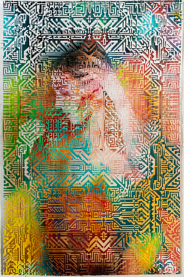
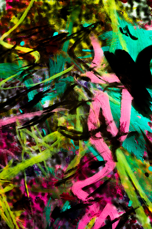
Artists occasionally react to technology in blatantly obvious ways. They might explore privacy and surveillance by hacking gallery visitors’ mobile devices, or comment on the sexualized female form in Instagram photos by taking their own erotic selfies. Brooklyn-based artist Lala Abaddon, whose work straddles the analog and digital divide, is more interested in exploring the less obvious interconnections between beings and technology.  

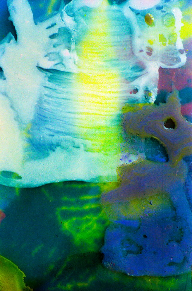
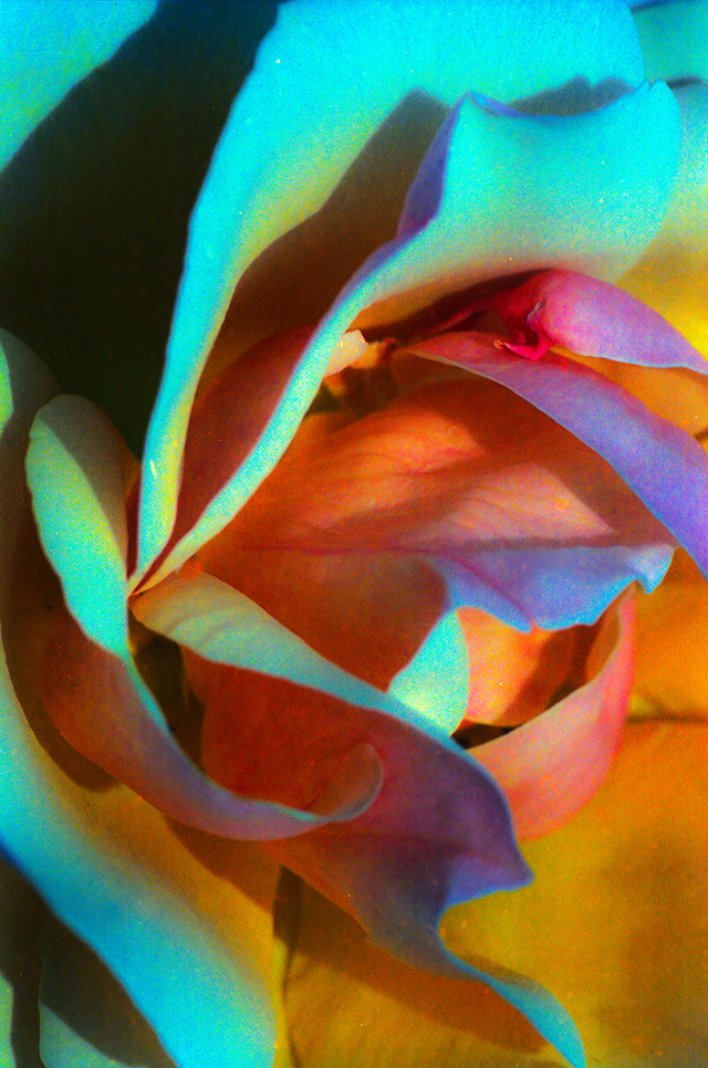
Abaddon's work ranges from the woven pieces Martyr Syndrome and Fractal Realities that look digital, to 35mm photographs of existing images to create pixelated effects, and 35mm macro images of paintings that can appear luminous. And in her Transfiguration project, Abaddon explores the concept of artistic ritual within the context of internet live-streaming.

When Something Inside You Dies, 24x26” (2015), and untitled macro painting
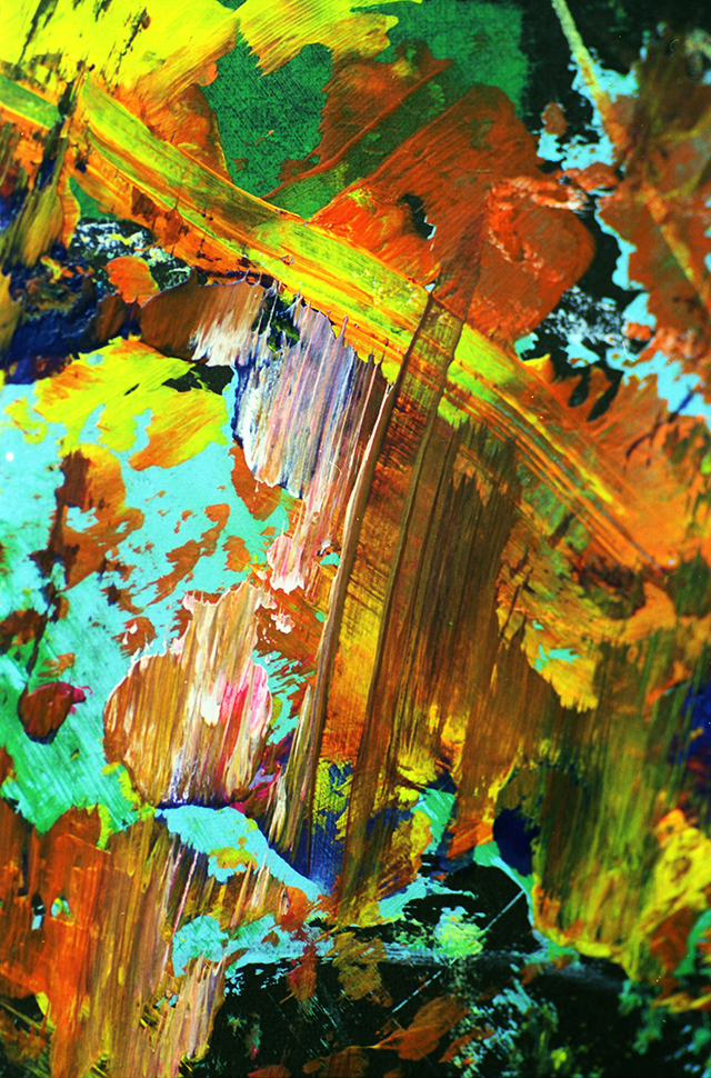
The weaving practice began when Abaddon wove two of her small cut-up photographs. As she tells The Creators Project, when she saw the results it was as if her mind had exploded. Abaddon grew obsessed with weaving since it gave her a way to work within her mind's restrictions.

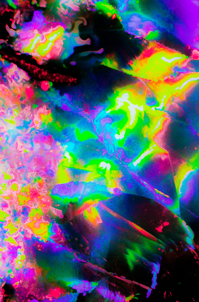
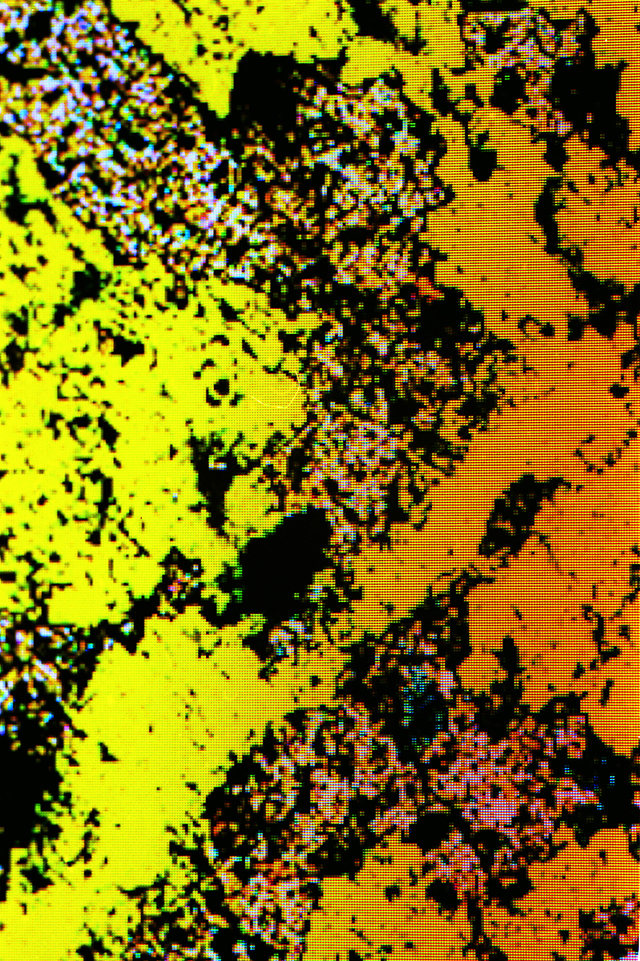
For her 35mm film works, Abaddon shoots photographs multiple times. This "re-photographing" of a painting or portrait from a computer screen gives the resulting photos a pixelated effect. This, along with Abaddon's creation of patterns—which are geometric and bitmap-esque in nature—all serve to make the work feel digital.

Abaddon, however, insists that there is a lot more going on in the 35mm works than just a digital vibe. Despite the fact that the works look nice online, she feels that they are best viewed in person. For her, the discovery of its true nature is pivotal to the experience of the work.

"I treat the photographic process the same as the weaving—it's a sacred ritual and I use a repetitive process on more of my final images," Abaddon says. "Sometimes it is a matter of painting, photographing, re-photographing, taking portraits, layering images or layering paint, using different types of paper when printing, like transparencies and translucent wash paper. All of the concepts of my weaving and photography are linear and seemingly obsessive."

Untitled macro painting

The 35mm macro painting series features similar techniques, processes and rituals. Abaddon tries to mimic certain digital ideas when painting and when photographing a painting in 35mm macro format.

"The concept of light is one connection between that because the natural light I usually photograph paintings in effects the way the color will be processed on the film I use," she says. "It allows me to explore a wider palette, especially when re-photographing a painting from the computer screen. It's with that and other linear concepts—like using transparent surfaces to initially paint on, both as a metaphor and as a function—that I make many choices and take many paths based on intuition and all else in between."

Untitled macro painting

As Abaddon says, her work is traceable back to photography. When she was a kid, her father taught her how to use a 35mm Pentax camera. So, in a sense, she has always sort of seen the world through a lens or in a box.

"I view the world that way mentally, being raised in the dawning of the digital generation, and then I have this ongoing narrative of my journey with life that I have always wanted to document," she says. "Photography opened me up to that world that I wanted to share but ultimately painting and weaving play immensely important roles. It’s only through the use of many different practices that I think my voice can be heard, be it visual, spatially, or metaphysically. Everything ties into one another and I think that is the impetus of my work."

Untitled 35mm macro film

The friction between analog and digital in Abaddon's work is intentional. She's not only interested in the relationship that analog and digital technologies and media have, but in the relationship they do not have, which she says is dominating her work more and more.

"Through using the oldest art known to (wo)man, and filtering it through my digitalized mind, I feel like I am saying that in our culture and art and hearts there is an imbalance," Abaddon explains. "And I am just trying to hold a literal mirror to that metaphor."

Untitled 35mm macro film

"I'm definitely exploring the connections between all beings and how technology has not only driven that past my own wildest dreams, but has shaken us all to the point of feeling that liminal connection so intensely," she adds. "There seems to be this shift happening in the universe that is like a tipping point—we can use what we’ve been given or created and try to enact some positive change, or bring something beautiful, or remind people why to love… or we can destroy."

Abaddon experiences life across many different realities: in the waking world, in a sleeping and dreaming world, and in a daydreaming world. These and other aspects of her personality infect the work. And like most people, she wants to share the things that interest and matter to her, which the internet allows her to do.

Untitled 35mm macro film. Image courtesy the artist
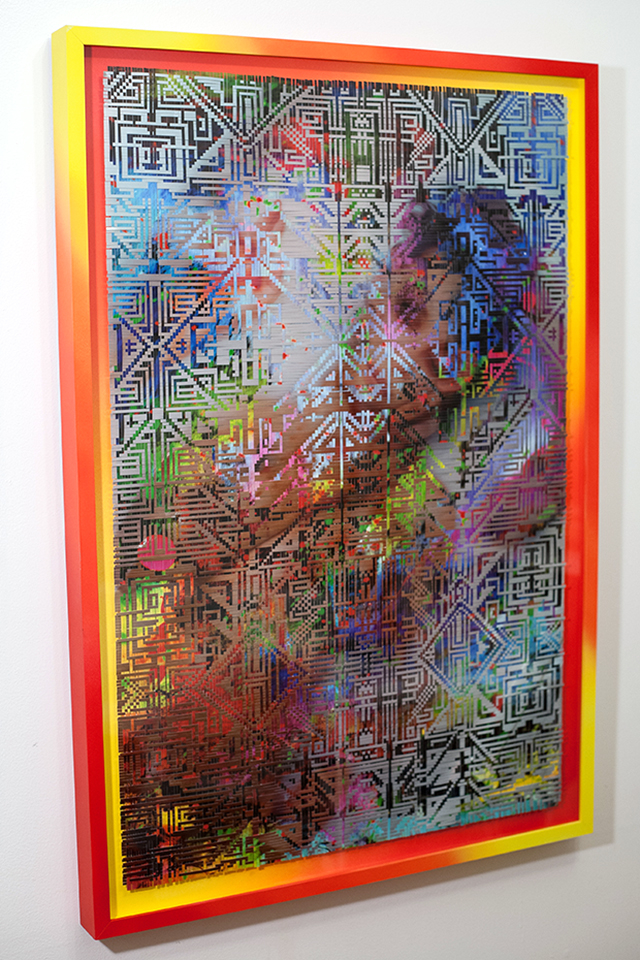
Abaddon puts this impulse into action with Transfiguration, a live-stream of her weaving practice, and a long-term "meditation" dedicated to the ritual of art, and the "pure and raw need to create it." Abaddon describes art as a religious experience, and art her religion. Like a religion, Transfiguration allows her to create connections, if not through human contact then at least through what she calls "a congress of the mind."

"When I weave a work it will take me countless long days, and I will weave for 10 hours at a time for weeks," Abaddon says. "In that time I really focus on the concepts of my work, I set intentions, and I try to put this energy into the work. Allowing a viewer to watch me while I weave through a live-steam, often in silence, is letting you into that ritual behind everything I hope for you to feel in my work. But it is also a commentary on how maybe we are ultimately alone, and it asks the question, 'Can we really feel, can we really empathize with someone else’s pain; and, thusly, can we somehow find compassion?'"

You Can't Steal My Soul, 24x36'' (2015). Image courtesy the artist

Abaddon is currently working on upcoming solo shows, and is also working on projects that are "more conceptual, sculptural and installation-based." "Things are growing into a larger form, it seems like I can create a more powerful experience and elevate the work, so that is what I am striving to do," she says.

Click here to see more of Lala Abaddon's work.

Watch a Digital Dancer Whirl Through the Underworld

As Digital Art, Contaminated Water Looks Beautiful

Become One with Nature in This Synthetic Installation

Thursday, December 17, 2015

Post-Human Particles Explode from a Data Glitch Matrix

Screencap via

Apophenia: it happens all the time. We see faces in the clouds, connections in phone numbers. Someday, when there's a visual component to mind transfer between our brains and computers, you can bet we'll see patterns in the static. Perhaps ahead of this curve, then, are today's artists working in glitch, using errors—the human parts of software—to give meaning to what we today comprehend as boundless data realm. 

These patterns come alive in the new video from The Dataists—visualist Maggy Almao and sound designer Antoine Marroncles. Polygonal busts distort, particles burst, and the utter chaos of the theoretical world is made at once human and horrifying. Once we're post-human, will we remember having been? Ask yourself this while watching t3t’s_3.14 below:

t3t's_3.14 from Maggy Almao on Vimeo.

Click here to visit The Dataists on Tumblr. 

Related:

'Glitch Art Is Dead'

FIFA Video Game Glitches Show the Comedy in Corruption

Keep Warm with Glitch Art Scarves

A Street Art Skate Park Fills a Former Spanish Church

Images courtesy the artist

A church in Asturias, Spain that was converted into a skate park just got a stunning new coat of paint thanks to Madrid-based street artist Okuda San Miguel. Known for his stunning geometric vistas, San Miguel needed to paint the Church of Santa Barbera, a.k.a., the Kaos Temple, the moment he saw it on the internet. "[The church] with a skate park is an amazing image. I fell in love with the place, because both concepts were so right together," he tells The Creators Project. 

The skate park's hallowed setting is heaven for holy rollers and blasphemers alike, but San Miguel's work brings it to a whole new dimension. It was originally converted from hundred-year-old place of worship to public half pipe thanks to a crowdfunding campaign on Verkami that got picked up by Red Bull. They invited him to paint the space before they opened it to the public on December 10, and Danny Leon broke in the newly rainbow-fied house of shred. 

Drawing on influences from Hieronymous "THE BOSH" Bosch, Max Ernst, René Magrite, Salvador Dalí, Takashi Murakami, and Yayoi Kusama, plus Indian, Mexican, and African folk art, San Miguel considers the Iglesia Skate to be his most important work to date. He brought his 100 to the holy ground. "When I do artwork like this, the heart only can transmit good vibes to the public. The icon of the Kaos Temple is three positive symbols: +++."

For those that think building a skate could be seen as sacriligeous, worry not. "The funny thing is that some old guys, who used to be real altar boys at this church were there," San Miguel recounts. "Their opinions about the temple's new life was amazing and totally positive."

Check out pictures of San Miguel and his team painting nearly every surface of the century-old building in the images below.

Click here to learn more about Okuda San Miguel. 

Related:

A Skater's Paintings Reveal the Rise of Malaysian Street Art

Korean Artist Koo Jeong-A Creates Glow-In-The Dark Skate Park In France

The Time for Multi-Storey Skateparks Is Now

Tuesday, December 15, 2015

Become One with Nature in This Synthetic Installation

Pascual Sisto, En Plein Air installation views at Brand New Gallery, Milano, 2015. Courtesy: Pascual Sisto and Brand New Gallery, Milan.

Oscar Wilde's ever-quipped quote, “Life imitates art far more than art imitates life,” is harshly disproved in multimedia artist Pascual Sisto's latest solo exhibition, En Plein Air. This ambitious installation, which includes an Oculus Rift VR ‘natural’ environment, projected gobo stencils algorithmically generated, and a dye-infused carpet installed in the entirety of the space’s floor, art does its best to imitate life in its most natural order.  

Pascual Sisto, En Plein Air installation views at Brand New Gallery, Milano, 2015. Courtesy: Pascual Sisto and Brand New Gallery, Milan.

The show, currently on display at Brand New Gallery in Milan, bases itself on a very specific mimesis of nature. Every element in the installation relates itself in someway to the Gold Dust Laurel (or Aucuba Japonica ‘Variegata’), a small houseplant known for the abstract, gold markings that occur on its leaves. The origin of the Gold Dust Laurel is also of importance to the exhibition, being a plant that has been “produced in strict cultivation by selective breeding” according to the press release, as the variegation that causes the gold discoloration is effectively a mild disease that occurs within the plant.

Pascual Sisto, En Plein Air installation views at Brand New Gallery, Milano, 2015. Courtesy: Pascual Sisto and Brand New Gallery, Milan.

For the show, the long halls and rooms of Brand New Gallery are cast in mild darkness, with the only light emanating within the space originating from scattered, projected balls of light meant to imitate the golden specs on the Gold Dust Laurel. Seemingly random, the projected specs are in fact based on a “synthesized version of the [Gold Dust Laurel] pattern” as per the press release, changing their size, geometric tendencies, and spatial qualities accordingly. Essentially, Sisto has managed to generate an algorithm that successfully replicates an element of nature’s randomness.

Pascual Sisto, En Plein Air installation views at Brand New Gallery, Milano, 2015. Courtesy: Pascual Sisto and Brand New Gallery, Milan.

En Plein Air also makes use of more direct and synesthetic approaches in its reflection of nature. The installation incorporates scent, the often forgotten human sense when it comes to art, through an ultrasonic diffuser that releases a unique nature smell, developed by Sisto, in sporadic intervals. Sound is another crucial element in the installation, with a customized soundscape emulating wildlife ambiance echoing throughout the gallery rooms.

Pascual Sisto, En Plein Air installation views at Brand New Gallery, Milano, 2015. Courtesy: Pascual Sisto and Brand New Gallery, Milan.

To immerse yourself in Pascual Sisto’s simulation of natural order, visit Brand New Gallery through the end of this month. See more of Pascual Sisto’s multimedia works here

Related:

Software Turns Your Trackpad Gestures into Painterly Brushstrokes

Now You Can Try Out the Picture Frame for Digital Art IRL

Meatballs Made of Bugs and Algae Still Look Good Enough to Eat

Thursday, December 10, 2015

Americans Are Worried About Terrorism, And That Could Help The GOP

The terrorist attacks in Paris and in San Bernardino, California, have reshaped the 2016 presidential campaign: Terrorism is now a top concern.1 All else being equal, that could help the Republican nominee if it continues through November. Americans trust Republicans more than Democrats to handle terrorism, 44 percent to 34 percent, according to a Pew Research Center survey from July, and — not surprisingly — there has been a strong link between who Americans trust on their top issue and who they vote for.

In 12 presidential elections since 1956 with polling available (we’re missing 1992, 1996 and 2000), Gallup or CBS News asked Americans in the fall of the election year what the most important problem facing the country was. The pollsters then asked, “Which political party do you think can do a better job of handling the problem you think is most important — the Republican Party or the Democratic Party?” Below I’ve charted the Democratic edge (or deficit) on this question against the result of the presidential election.

enten-terrorismfocus-1

Every time Democrats have been trusted more on people’s top issue, the Democratic presidential candidate won. Every time Republicans were more trusted, the Republican presidential candidate won. This isn’t super surprising because we’re including everyone, not just the subset of respondents whose most important issue was listed by the highest number of people. In 2012, for instance, we’re including the people who were most concerned about the economy (and which party they trusted more) and the respondents who rated health care as their top concern (and who they trusted) and so on.

In the most recent campaign where terrorism was at the top of voters’ minds, 2004, Republican George W. Bush was re-elected. Bush carried voters who selected terrorism as the No. 1 issue by a wider margin (72 percentage points) than voters who selected any other issue.

There are already signs that terrorism is affecting this campaign. Democrats are at the mercy of President Obama, whose response to the recent attacks has been panned by the press. Republicans, on the other hand, are dragging the debate to the right. Even though Donald Trump may have gone the furthest, many Republican candidates have called for pausing the resettlement of Syrian refugees in the U.S. A majority of Americans agree with that position.

Of course, it’s overly simple to say that terrorism becoming an important issue now means the Republican candidate should be favored next year. For one thing, situations change; foreign policy issues (Iraq, terrorism, etc.) were also near the top of Americans’ minds at this point in the 2008 cycle, but the economy became the dominant issue by the time of the election. Moreover, even if terrorism remains a focal point of the campaign come next fall, it will also matter what other issues are at the top of voters’ minds, and how heavily they favor one party or the other. In 2012, Mitt Romney beat Obama on the economy, the issue that a plurality of voters found to be the most important by a small margin, but Obama swamped Romney by a much larger margin on health care, the issue that the second-highest number of people thought was most important.

Still, current polling and evidence from past campaigns do show that the more Americans believe terrorism is the United States’ biggest problem heading into Election Day 2016, the higher the chance that the Republican presidential candidate will win.

[Premiere] 'Cloaque' 2015: The Group Art Show That's Actually a Video

Images courtesy the artists

The annual audiovisual group show curated by Claudia Maté and Carlos SáezCloaque.mov, unveils its 2015 edition exclusively on The Creators Project today. A video mixtape that also complements the web-based vertical scrolling collection, cloaque.org, features four-minutes of video art in the same simple, highly effective curatorial process as the previous years’ compilations. It keeps an emphasis on the works' quality and the fluidity and cohesion of their video editing, despite the very specific and personal visual content that each contributor offers up.

“Each Cloaque.mov is for us like a video art annual compilation; we just put together what we like most from each year,” Maté and Sáez explain The Creators Project. “It is hard to decide only five names, so we choose them in order to get a variated and multidimensional selection, where each artist represents a sector or style in the video art scene,” the spanish duo adds, highlighting that their selection process is mostly driven by the year’s “coup de coeur.”

This year lineup includes works by Sabrina Ratté, Hakihito Tanigushi, Pascual SistoGeoffrey Lillemon, Joe Hamilton, and both curators, and provides viewers with a vibrant eye-catching compilation that melts together the cream of the crop in conceptual video art with an electronic soundtrack by Amsterdam-based sound designer Dylan Galletly.

Enjoy the 2015 video patchwork above, and see a few of stunning screencaps below :

Sabrina Ratté

Geoffrey Lillemon

Akihiko Taniguchi

Pascual Sisto

Joe Hamilton

Click here to visit Cloaque.org. 

Related:

Electronic Signals Warp a Series of Virtual Lobbies

Take a 5-Minute Tour Through the Year in Video Art

Video Artists Explore a Decade Under YouTube's Influence

Tuesday, December 8, 2015

Electronic Signals Warp a Series of Virtual Lobbies

Screencaps via

Like an airport, the modern hotel is a gleaming space of arrivals, exits and waiting. Much like the enclosed spaces of a J. G. Ballard novel such as High Rise, they impose themselves on guests’ minds, altering the psychology to create something not so welcoming, but alienating instead.

Video artist Sabrina Ratté, one half of the avant-garde audiovisual electronic duo, Le Révélateur, and creator of immersive virtual architecture and synthesized music videos, explores this Ballardian realm in the virtual space of her new video artwork, Escales. Taking hotel lobbies as her inspiration, Ratté synthesizes virtual rooms, making them oscillate, flicker, blur and slowly mutate to the unsettling ambient soundtrack of Roger Tellier-Craig.

Escales is the result of the manipulation of electronic signals using digital means,” Ratté says. “Electricity, as raw material, is being sculpted, transformed and altered to be reborn as architecture.”

“Inspired by hotel lobbies, the video recreates the ambiance of these aesthetically rigorous spaces which, despite their aim at being inviting, are in fact impersonal and cold,” she added. “It's a transit space, neutral, which can be reminiscent of certain virtual experiences where the visitor is anonymous and only passing by.” 

Watch Escales below:

Escales from Sabrina Ratté on Vimeo.

Click here to see more of Sabrina Ratté’s work.

Related:

[Premiere] Space Shapes and Static Sparkle in This Synthesized Music Video

UFO Sightings And The Paranormal Abound In Sabrina Ratté's New Video Trilogy

[Exclusive] Experimental Audio-Visual Duo, Le Révélateur, Share Glitched-Out Video "Afterimage Selves"